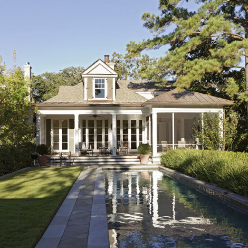
If every garden has its own story, this peaceful respite in Mount Pleasant’s Old Village is a tale of triumphs, both great and small. Driving by on Royall Avenue, you might not even know this quiet rectangle of sculpted green exists, which is exactly what the homeowners wanted—a private haven hidden from view. Originally a nondescript lot filled with weedy plants, a few diseased pecan trees, and a lightning-damaged magnolia, this patch of earth was deftly brought back to life by the vision of landscape architects Sheila Wertimer and Cindy Cline of Wertimer & Associates.
After their new home—a beautifully detailed, traditional design by Dufford Young Architects—was complete, the owners wanted the landscape to feel like an organic extension of the residence, rather than mere embellishment. “This project challenged us to do something in keeping with the aesthetic of the house and remarkable in a subtle way,” explains Wertimer. “Our client wanted the plantings to be dramatic but simple and low maintenance. I think we achieved that.”
Wish List
A cohesive design, one that would flow artfully between indoors and out, while incorporating a lap pool and a garage? This was no easy task on a lot that sloped toward a drainage easement across the back of the property. “That easement ended up shaping a lot of what we did,” says Wertimer, “as did the placement of the house and the setbacks of the neighborhood. However, all of the drainage needed to gather at the back of the property. There was no room for error.”
The solution? The designers sculpted the land and altered the grade. Pilings were added to support the pool, and retaining walls artfully incorporated to build up the entire rectangular garden. Happily, this had the added advantage of bringing the garden area only a couple of steps down from the house, achieving the homeowners’ wish for a seamless transition from house to garden.
Dramatically Simple
With infrastructure in place, the plantings could deliver the drama. The back garden wall, thickly covered with creeping fig vine, sets the tone. Its deep green hue provides a serene backdrop to the sparkling pool and tidy swath of lawn and screens the garage from view. Flanking each side of the small doorway at the center, two Japanese maples were pruned to inspire more of a two-dimensional effect. “It’s so subtle and such a lovely detail that really worked,” says Wertimer. “I didn’t realize it would be as wonderful as it is. You wouldn’t even know there’s a garage back there.”
Though severe in its lines, the minimalist design has complexity and softness, through what Wertimer calls a “delicately nuanced planting plan.” Double rows of African irises fall delicately over one length of the pool, blooming from spring to fall and softening the hard edge. Behind them rises a double row of boxwoods, which are growing out of their formal ball shapes into a more fluid, undulating line. There are also papyrus, narcissus, and sweet autumn clematis; camellias, azaleas, and hydrangeas; a bevy of ferns and potted annuals strategically placed so that there is almost always something blooming, but in a quiet, subdued way.
“We ended up with a garden more organic and less structured than originally thought. What started out as a site constraint turned into an opportunity,” says co-architect Cline, referring to the location of the drainage swale. “It turned out to be more poetic and magical and unusual. The proportions, the relationship of the lawn to the pool, the whole outdoor room feels elegant.”
Room to Grow
After four years, the garden is fairly well-established, and the homeowners are enjoying its constant evolution. “A lot of people don’t understand that a garden is a continuously growing, changing, evolving, fluid being,” says Wertimer. “It’s not static.”
Ask the homeowners, and they’ll tell you the project is a complete success, the marriage of outdoor and indoor fluidity in a secluded, intimate space. “Our plan took a lot of its cues from the interior of the house and the architecture,” says Wertimer. “In some ways it’s traditional architecture, but with variations and nuances. The homeowner’s interiors are the same way. She has a lot of traditional furniture, but re-envisioned. She has a good eye. That’s what we did—took a clear plan and distilled it to the essence of a very Charleston garden, then overlaid it with complexity in terms of plants and subtle detail. And it worked.”
Reimagine Your Landscape
Tips from the pros
Inventory your lot and the architecture and note its advantages and constraints.
Approach your yard as an extension of the home and as a series of outdoor rooms to more easily envision how your garden should be divided.
Think about how your garden might support daily life and interests. Those who cook may want a space for growing vegetables and herbs, while a love of entertaining might require more terrace space and seating.
Consider how much maintenance you want to take on. This will dictate the extent of paved spaces, lawn areas, and plant beds as well as selections.
Take visual cues from your house to influence forms and help cultivate a complementary palette of materials and patterns.
Think about function and circulation. For example, the walk from street or driveway to front door should be easy to navigate, and a direct connection from the kitchen to your outdoor grilling space more convenient.