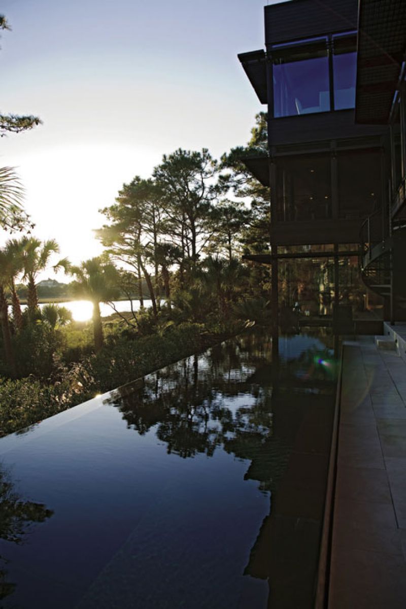
I asked for only a few things: I wanted lots of glass, I wanted modern, and I wanted tall.” These were the marching orders from homeowner Marcia Seremet to architect Ken Huggins, who then went to town—or, rather, to quiet, serene island—sketching a bold plan sure to shake up Kiawah’s typically conservative style.
Marcia and husband Denny had fallen in love with Kiawah while visiting on a golfing weekend and realized in short order that their search for the ideal future retirement spot had ended. “Kiawah felt like a tropical island to us—we didn’t know we could get that feeling so close to home,” says Marcia, who still divides her time between Kiawah and their Potomac, Maryland, home, with hopes that Denny will wind down his career as a
finance specialist for a national home builder in the next few years, making way for them to become permanent islanders.
In the meantime, the Seremets enjoy spending as much time as possible exploring Kiawah and the surrounding area, by bike (“I hadn’t been on one since I was 12! I love riding all over the island,” says Marcia), by mouth (both are avid foodies, making the rounds of Charleston restaurants and supporting the Wine + Food Festival), and at home, soaking up their unparalleled views: marsh pines, birdlife, and a meandering waterway in the foreground; the Ocean Course in the middle; and a glistening expanse of the Atlantic stretching deep into the distance. In fact, while the house’s design is stunningly out-of-the-box, it defers totally to their out-of-this-world vista—and to the large live oak smack in the middle of the lot.
“It was certainly a complicating feature,” says Huggins, noting the lovely, albeit inconvenient, sprawling tree. “I’d draw diagonals across the lot, and there’s this big oak right in the center. I realized we had to just accept it and turn the tree into a gift.”
The solution was to create two separate wings embracing the tree, with a finished, glassed-in connector—a dogtrot, in Southern architectural vernacular—bridging the two. The centerpiece oak sits on a berm, so there’s a gentle rise to the lot that had to be taken into account while trying to satisfy flood elevation requirements without plopping the house on stilts. With an architectural sleight of hand (and land), the ground-floor terrace appears to gently rise right out of the landscape, and the tree becomes a dramatic sculptural focus from all interior vantage points. And with walls upon walls of windows custom-made in Germany, there are vantage points aplenty.
To provide structural support to Marcia’s “lots of glass” wish, and give architectural counterpoint, the architect bookended the home with solid masonry stucco walls, balancing the ephemeral openness of glass with a juxtaposed heaviness. “I like working with opposites, kind of a yin-yang thing,” says Huggins, who used a “collage of natural materials”—stucco, copper, wood, and glass—to make the mod design mesh with Kiawah’s raw and earthy ambiance. “When you see it from the road, the house kind of falls back into the trees,” he notes. “There are times I’ve headed there and driven right past it.”
Though Marcia and Denny gave generous creative leeway to their select team—Huggins worked alongside Maryland designer Larry Hall of Gardiner Hall International and local builder Russ Cooper—they knew they wanted an inverted floor plan, with an open flow between the kitchen and living/family room, a third-floor exercise room, and a home theater. Hall, who had worked with Marcia on their Potomac home, was integral to the project, serving as Huggins’ sounding board and Marcia’s mainstay. “He knows me and my tastes really well,” Marcia says. “I can tell Larry what I want, but I can’t visualize anything. When I saw initial sketches on paper, I thought, ‘Oh my, this looks like an office building.’ I told them, ‘I’m not living in an office building!’ But Larry assured me that I’d like it. I took his word, and sure enough, I love it!”
Other suggestions from Hall that played out well included turning what had been slated as a billiard room into a private study/reading room. “I like small spaces,” says Hall, and this oceanfront room is one of the more intimate places in the house, so he suggested making it a quiet, comfortable retreat with four inviting leather chairs for reading or conversation, a spacious desk, and a waterfall that is both a visual and auditory delight. “At night, it is so relaxing,” says Hall of the dramatic water element. “This space turned out to be one of Marcia’s favorites, too. It has a wonderful balcony, a wine closet, and a powder room—all right there.”
The most challenging part of the project, concede both Hall and Huggins, was
making the bold exterior blend in with the surrounding landscape and creating an interior décor muted enough not to interrupt the views. “When you’re oceanfront, especially on such a spectacular lot, the view is the most important thing,” explains Hall. “We used a neutral palette throughout so as not to detract from the landscape. The only color is in the artwork, most of which is from the 1940s and ’50s, and none of which is on the oceanfront walls.”
“There is good contemporary and bad contemporary,” says the designer. With natural materials, careful balance of drama and
subtlety, and accent on livability and sustainability (such as geothermal heating and air), this, Hall believes, “is a contemporary home that will stand the test of time.”