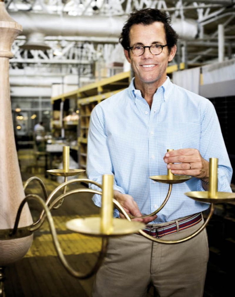
Good proportion is good proportion. You don’t have to be an educated architect to know it when you see it,” attests Mark Maresca. And although he’s a classically trained, award-winning architect who specializes in gracious home design, Maresca applies that tenet to his myriad design projects, whether they be residences, interiors, landscapes, furniture, and, since 1996, lighting.
That’s when Maresca—having recently completed work on his own home—launched a fruitless search for the perfect light fixture for its interior: something “very simple that would loosen things up a bit.” A born tinkerer, whose living room sports a brass and glass table he designed after college, he “cobbled together some bits of brass” he had on hand, and voilá, the Melissa wall light was born.
Eight years later, when local lighting design firm Urban Electric Company was in its nascence, Maresca met its president, Dave Dawson, who loved the simply elegant lamp, and it became a founding design. Today, a broad line of Maresca’s lighting—lamps, sconces, chandeliers, and lanterns—is produced in partnership with the company. “Over the course of the year, I’ll sketch and design four, five, maybe six lights that end up in client homes,” he explains. “And some of those we take into production.”
Maresca’s goal, he says, is to create designs whose patinas and proportions are so classical that they simply look right—not especially modern, nor particularly aged. That mission translates throughout his work, from the structures to the fixtures that illuminate them. “It was clear to us that Mark thought of lighting as an important extension of his architecture when he designed our Watson and Links Cottages at Cassique. His masterful approach brought a sense of purposeful intent to the finished products,” says Leonard Long, executive vice president of Kiawah Partners, who developed Cassique. “Good lighting allows everything to breathe and the furniture to shine,” Maresca notes. “A light should be as beautiful off as it is on, and it should add to the atmosphere of the room.”
Case in point: the Elizabeth light, inspired by a cottage he designed on the Chesapeake Bay and the wild grass that surrounded it. The fine, ethereal lines worked perfectly in the home’s four bedrooms. Indeed, every one of Maresca’s designs tells a story; some were conjured to counterbalance a dark, serious space, others to merrily reflect light in a family home. His latest, the Adams chandelier—set to debut this fall—is akin to a Cirque du Soleil act; it’s massive at six by six feet, and yet light as air with wispy lines. “It added reflectivity and lightness to a room that was potentially too serious,” Maresca says.
With his designs regularly landing in magazines such as Elle Décor and House Beautiful, it’s safe to bet that Maresca will be lighting the way for many years to come.