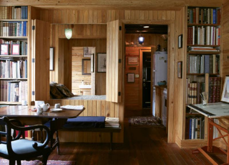
“We’re normal people, and this is just a house.” That’s how Charleston native and architect Christopher Liberatos settles into a conversation about the thoughtful revamp of the 377-square-foot condo that he shares with girlfriend and fellow architect, Jenny Bevan. “I think people often make the mistake of putting too much into their houses. Sometimes simple is enough; it doesn’t have to be monumental.” Christopher bought the Bee Street hideaway sight unseen. He was living in England at the time, and though he’d made up his mind to one day land back in his hometown, he first headed to Manhattan and the classical design firm Fairfax & Sammons, where he and Jenny met. Two years later, Christopher moved back to Charleston, where he opened a satellite office for the firm. In his off-hours, he went to work stripping out the space’s decades-old “upgrades.” Built in the 1840s, the condo is part of a kitchen-carriage structure that sits behind a manor house across from MUSC. A 1970s Post and Courier piece notes that the service building sat untouched for more than a century, the street end housing a ground-floor kitchen with an enormous fireplace and modest living quarters above; the rear was comprised of a downstairs carriage port with towering wooden doors and tiny rooms upstairs. But soon after the article was published, the structure was subdivided and modernized into apartments for med students. It remained as such until about four or five years ago, when the units were converted into condos. Christopher and Jenny (who was still in New York) sent floor plans back and forth as they toyed with the layout and tried to return their pending home to its humble beginnings, which meant tearing out sheetrock walls, a fiberglass tub, a popcorn ceiling, a window unit, vinyl windows, and loose-fill insulation in the attic. Christopher, whose former abode was a Manhattan studio apartment, ruled out an open floor plan, though that was the simple fix others suggested; he counters that one of the best ways to make a place feel bigger is to subdivide it. Today the condo is as shipshape and savvy about use of space as a boat cabin. Organic materials—stucco, brick, and unfinished cypress bead board—form a backdrop as modest as the abode likely was when it was first built, something the pair aimed to recapture for architectural integrity’s sake. And it isn’t equipped with central air, which Jenny and Christopher don’t want. The subject of it prompts a discussion of a 16th-century Turkish hospital, where breezes blow in and surrounding gardens promote healing. Their own space, says the couple, like the open-air overseas spot, simply feels good. “I don’t see myself moving again,” says Christopher, leaning back on a settee. Adds Jenny, “As far as our favorite place to be in Charleston, there’s no room, no building, or park that we like better than this.”
Here’s what they did:  Trimmed unfinished ceiling timbers with a sublime molding (which Christopher designed) to transform the beams into coffers. Relied on fixed elements— windows, fireplace, and front door—to establish the floor plan and determine how to divide the condo. Chose one color throughout the space, which amplifies it. Because the couple couldn’t settle on any single paint shade, they went with natural wood by default. With age and protective oil, it took on a rich, honey color.
 Maximized kitchen inches with open shelves, and crafted a wooden sink cover that adds counterspace.
 Saved more precious inches using bead board partitions (a mere one-and-a-half inches thick) instead of stud walls to separate the bath, bed alcove, and kitchen.
 Installed a bed alcove with bead board walls, drawer space underneath, and a slim closet to one side. (Operable shutters cut into the bed alcove walls allow air and light to flow through and give the condo a dynamic, open feeling.)